


Is there anything more mind-numbing, embarrassing, and futile as choosing a white paint for your home? It’s the lazy caricature of the over-wrought yet bored (and boring) housewife in every movie, right?
And yet, here I am.
The problem, you see, is San Francisco itself. San Francisco does weird things to paint and interiors, fluctuating between icy foggy days and days of blistering California sun. Up until we moved here, my go-to white paint was “White.” No paint mixing here, just a can of white paint thanks.
And then we moved to San Francisco. Our northern exposures turn everything within sight a dusty blue. Our southern exposure is so bright that you can no longer even tell colors apart. Our internal rooms get some hybrid mix of those, which translates into green.
The California sun can also be so bright that it bounces colors off the neighboring roof tops and buildings. I painted our kitchen a lovely warm greige Oyster (Benjamin Moore)…and it looks pink thanks to the spanish tile on the houses next door. Our hallway is Snowfall White, a very clean creamy white to balance out the cold northern exposure, and it turns light citrus as the sun sets and reflects off the green house next door.
Oh, and of course, we have wainscoting and bead board and picture rails all over the place, so each room could be painted a minimum of three colors, all of which need to coordinate, even as the colors shift with the weather and light.
As I walk through the apartment with a paint chip in hand, I see the color change right before my eyes. What is this, San Francisco?
And so now I’m tackling the bathroom, originally painted in “White.” It is a northern exposure with a large window, so bright yet frosty. The large window is also adjacent tot the green building next door. The existing white paint reads as a little grey and dingy, but also turns yellow/citrus when sunlight reflects off the building next door.
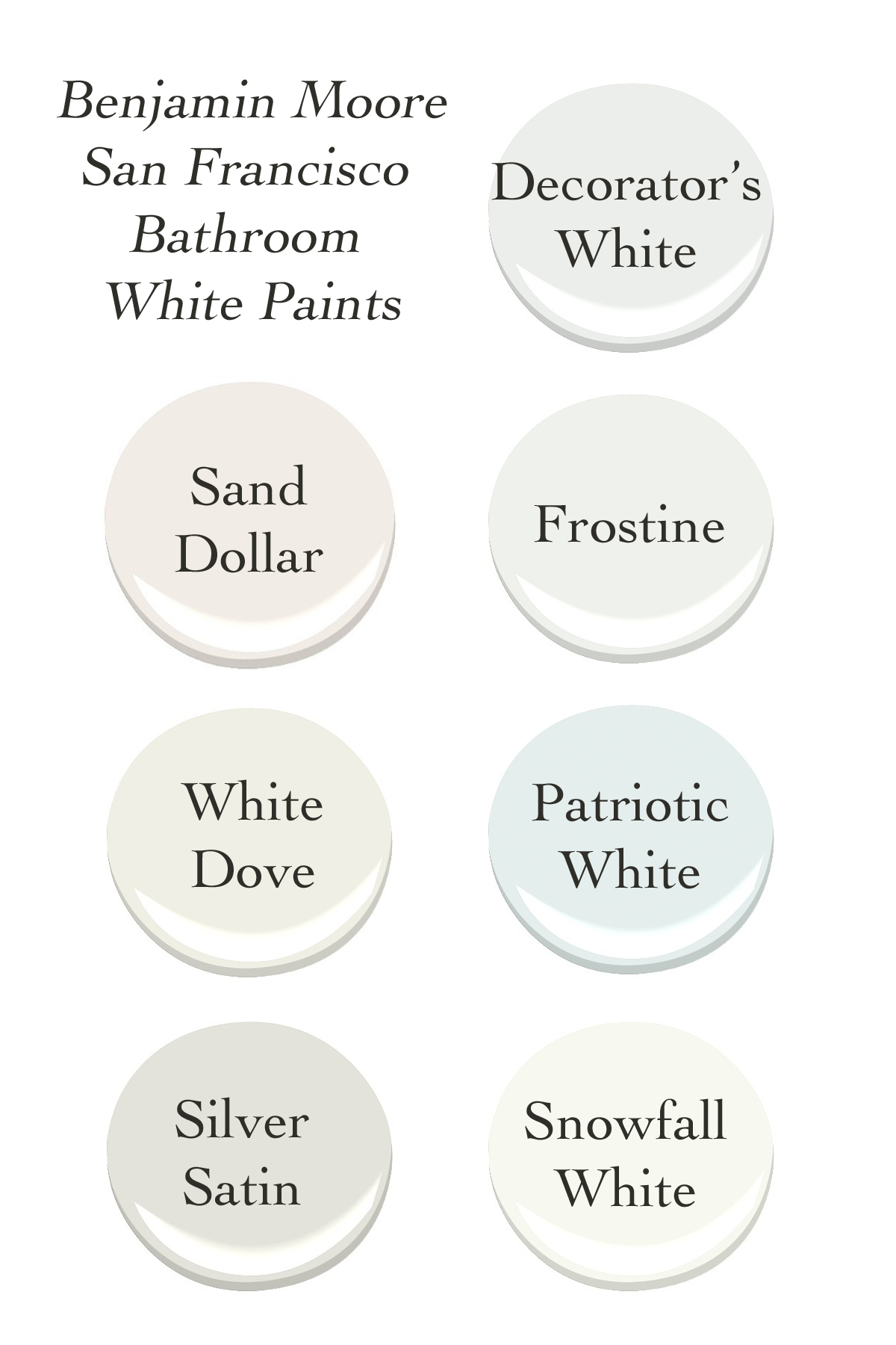
The above colors made a first cut. Decorator’s white, which is supposed to be a clean white, looks a little grey up on the wall. Frostine looks complex, but I can’t figure out if that’s a good or bad thing. Patriotic White looks like a frosty blue, which might be nice for a bathroom. White Dove looks like a muddled beige in cloudy weather, but a nice happy warm white in sun.
So, yes. Today, you’ll find me staring at white paints on the wall, brow furrowed, alternating between exasperated and indifferent.
Have you picked out white paints for your places? What did you go with? I’m all ears for recommendations.
