


Sometimes, you set out for the day, camera in hand, ready to take gorgeous photos of San Francisco/your family/your hike and…it’s overcast. You take the photos anyway, and then you download them. Nothing is looking good. Actually, everything is looking totally dark, dank, and lifeless.
Here are a few tricks for saving those photos and getting the most out of them.
First, let’s figure out why your photos are so disappointing and sad.
Here is the bay on a beautiful day (unless otherwise stated, all of these photos are in their raw, unedited form):
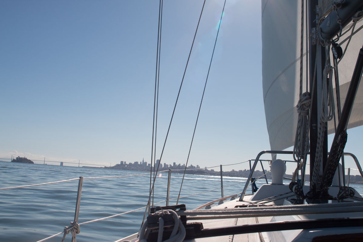
Hello sparkly blue water. Hello glorious ship. Bay Bridge, you have never looked so good.
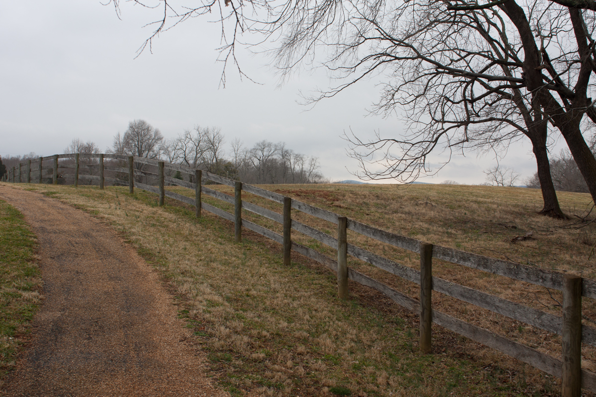
Here is roughly the same photo, taken on a rainy day:
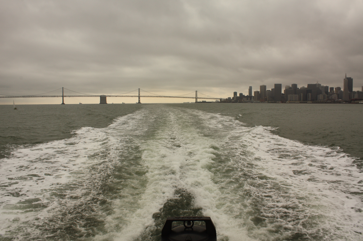
Oh, who me bitter? YES, VERY BITTER ACTUALLY. Those two photos explain ENTIRELY why I used to get bummed out on foggy days. It’s such a huge difference!
So, let’s contrast. For starters, the sky in one photo is a gradient of blue, the other photo is actually a medium gray. The water in one photo is peaks and valleys of blue, the other photo is a flat greenish gray. The skyline in one photo is a sharp silhouette on the horizon; the other photo is a muted dark gray. The entire image looks flat, like there is no dimension to it.
Let’s see what we can do.
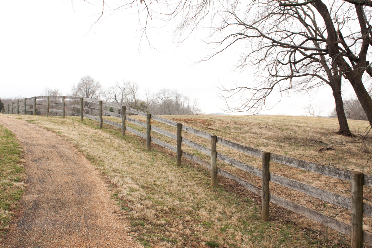
1. Overexpose your photos.
What we need to do to salvage the photo is get rid of all that grey. Skies and whites often appear grey in overcast or foggy photos. I’ve found that slightly over-exposing the photo (either when you take it or in post-production), gives you a more pleasing photo.
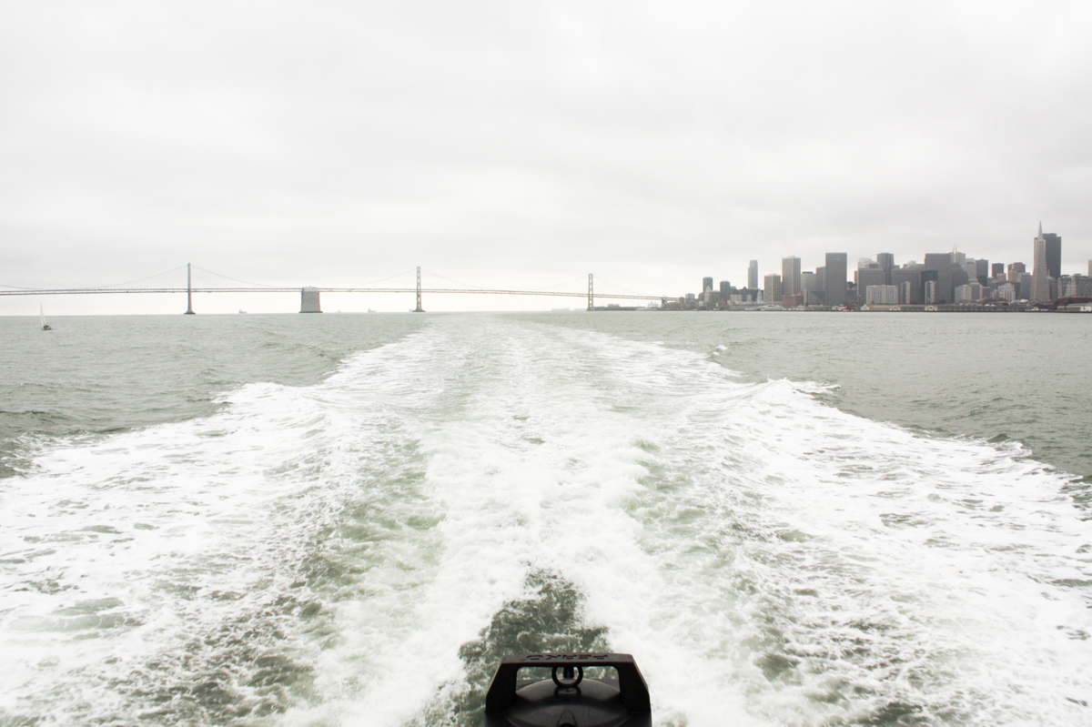
Well, things are getting less depressing, at least. In addition to over-exposing, I’ve also boosted the contrast (to add some dimension back in) and reduced the amount of yellow in the photo (to get rid of that greenish haze.)
Better, right?
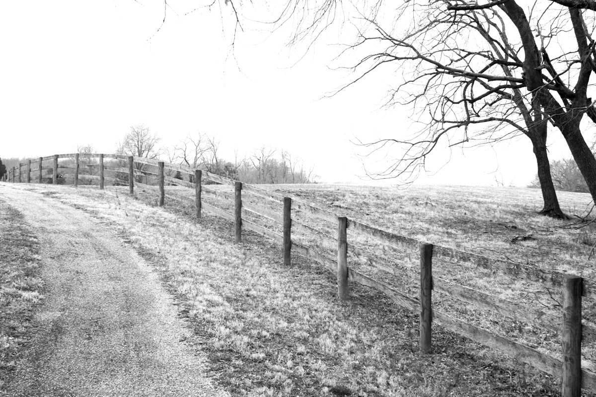
Now, let’s crop it into something that makes a bit more sense.
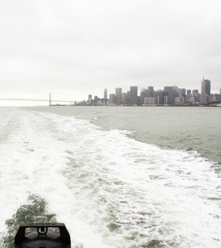
That’s serviceable. Not the best photo you would have taken on your vacation to San Francisco, but a lot better than what we started with.
What I also did with this photo is…
2. Reduce saturation
I didn’t go entirely black and white with that photo, but it was on the table. Sometimes, the greys and whites overtake the photo and there’s no color of interest in the vicinity and the sky is blown out, and it’s time to call it. It’s time to reduce that photo to black and white.
In the above photo, I simply reduced the saturation. Below, I went to black and white.
You’ll recognize the sad, familiar green/gray overcast.
Now, overexposed:
It’s still fairly blah, and it starts looking cartoonish if I try to mess with the contrast more than I’ve already done. Let’s take it to black and white.
Again, I’m not sure it’s perfect, but it’s better than the original. You have to work with what you have.
Speaking of which:
3. If you can find a colorful object, force it into the frame, then over-saturate.
On rainy days, bright colors can look amplified. Greens especially look extra lush. Anything that contrasts against all that white or bright green becomes a jewel. Let’s see this in action.
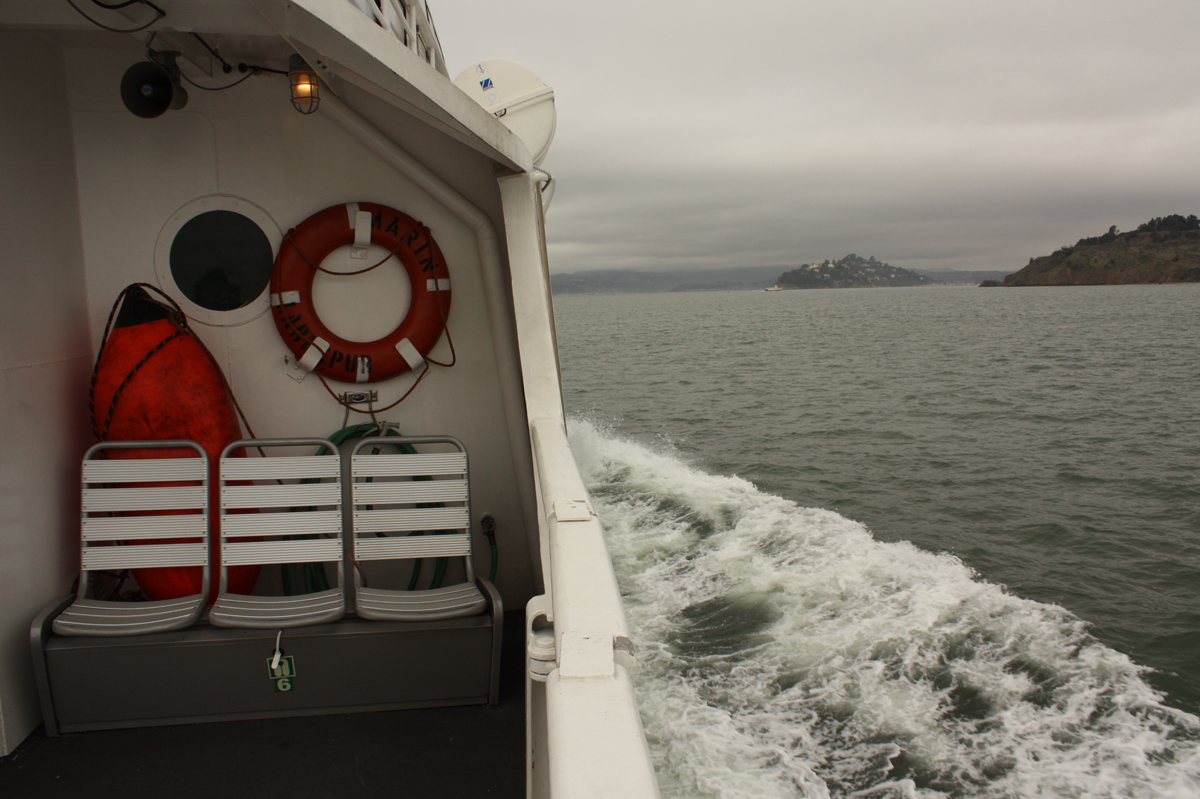

This was shot on the same day as the Bay Bridge photo above. This time, I whipped around and got a photo of the boat and its bright orange lifering. Overexpose, boost contrast, increase saturation to take advantage of the bright orange contrasting against all that white.
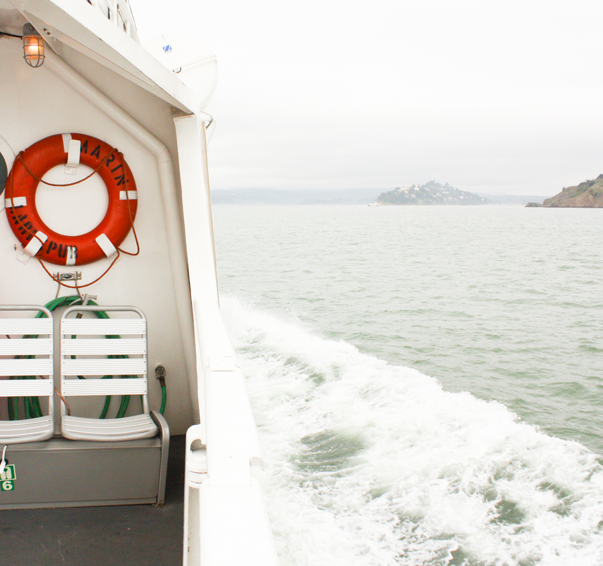
And then I cropped it to the 1/3rd rule. I like it!
Now, there isn’t a iconic bridge or skyline in sight (no Bay Bridge, no Golden Gate Bridge), but it’s a lovelier photo overall than the Bay Bridge photo. Sometimes, you have to change your expectations when faced with noncompliant weather.
Another example of boosting color:
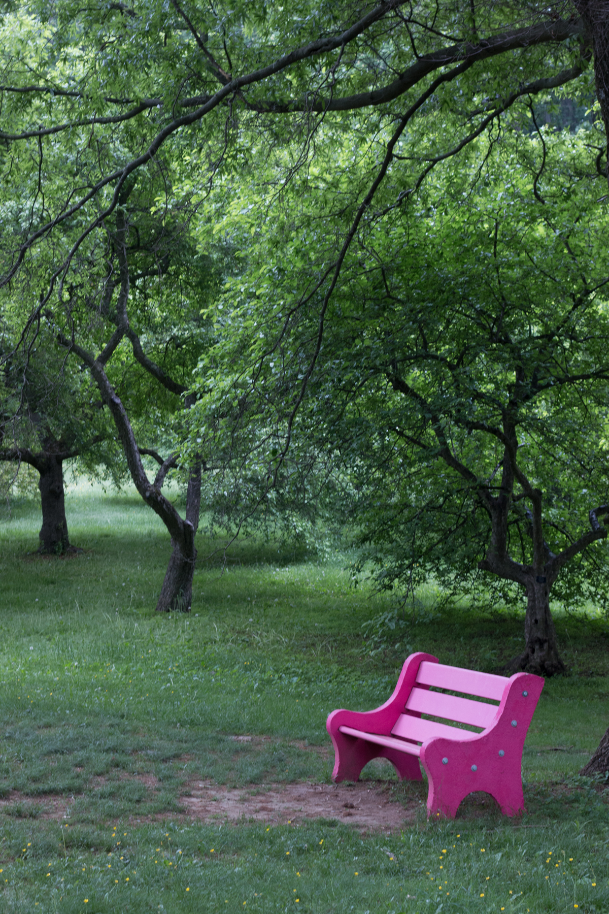
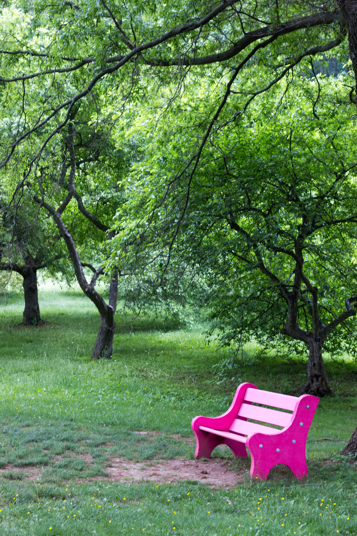
It’s raining in this photo. The greens looked extra vibrant, even in person, and coming across this hot pink bench surrounded by the green was a windfall. A little over-exposing, removing the blue cast, boosting contrast, and it’s a sweet photo of a bright pink bench.
4. Accept the elements
It took me a while, but I’ve come to appreciate the fog. It adds layers of interest to a photo series. Keep an eye out for what makes this weather interesting — the mood it sets, the sun that can cast beams across the fog, the stillness and the quiet.
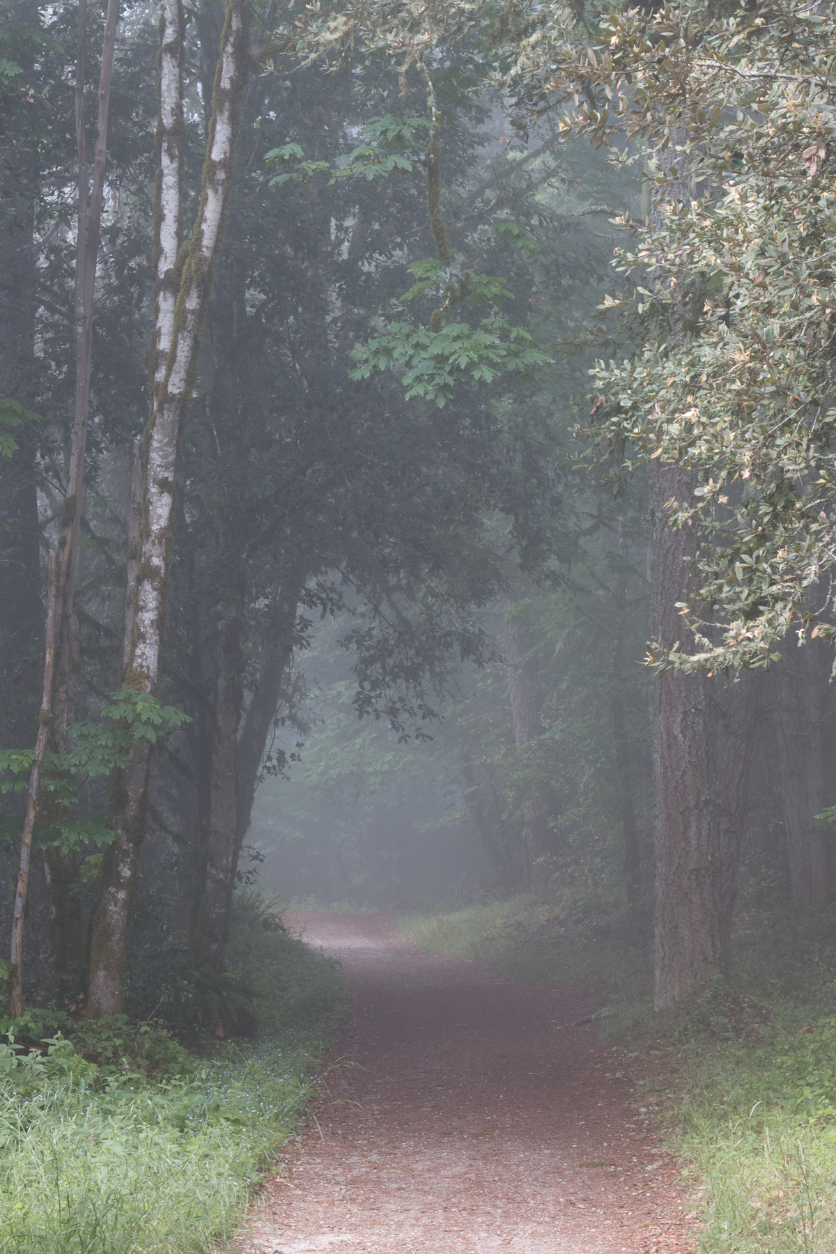
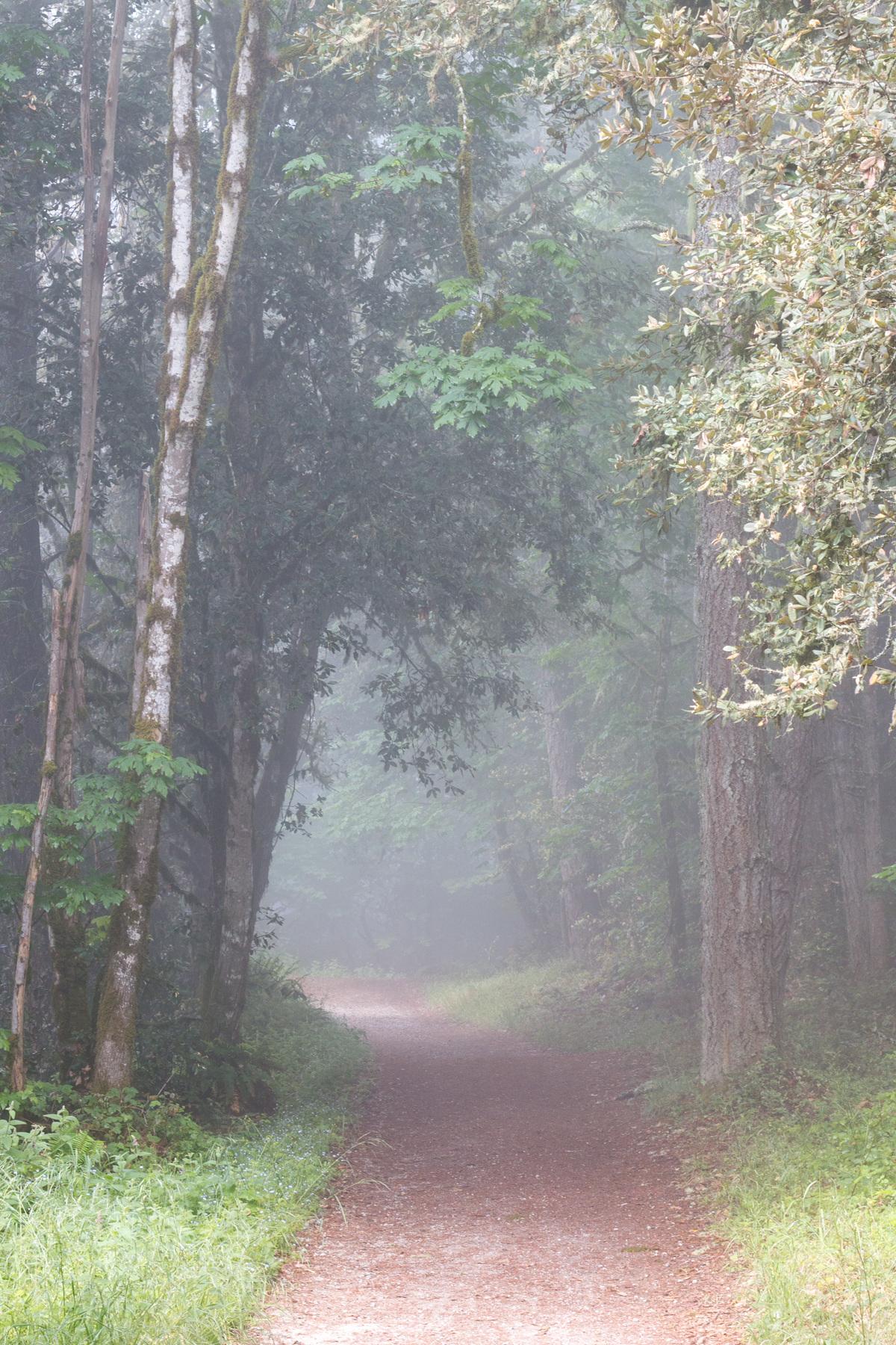
I didn’t do much to this photo — overexpose ever so slightly, boost contrast ever so slightly, boost saturation to bring out the foreground. I kind of liked it as is, really. You wonder whether a unicorn is about to jump out. (You can see the rest of the photos from this hike here; this photo didn’t make the cut.) I’d say the fog makes these photos.
5. Go for the white-out
When you don’t get the blue sky day you want, your next best bet is to go for pure white out conditions. The above photos rationalize the weather away. A white-out photo turns perfect on its head, and gives you something even more startling.
This is one of my favorite photos of Ocean Beach:
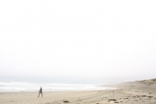
This photo apologizes to no one for its foggy skies and disappearing coastline (and due to low-light conditions, I had a slow shutter speed and so the surfer ends up blurred). I love it.
