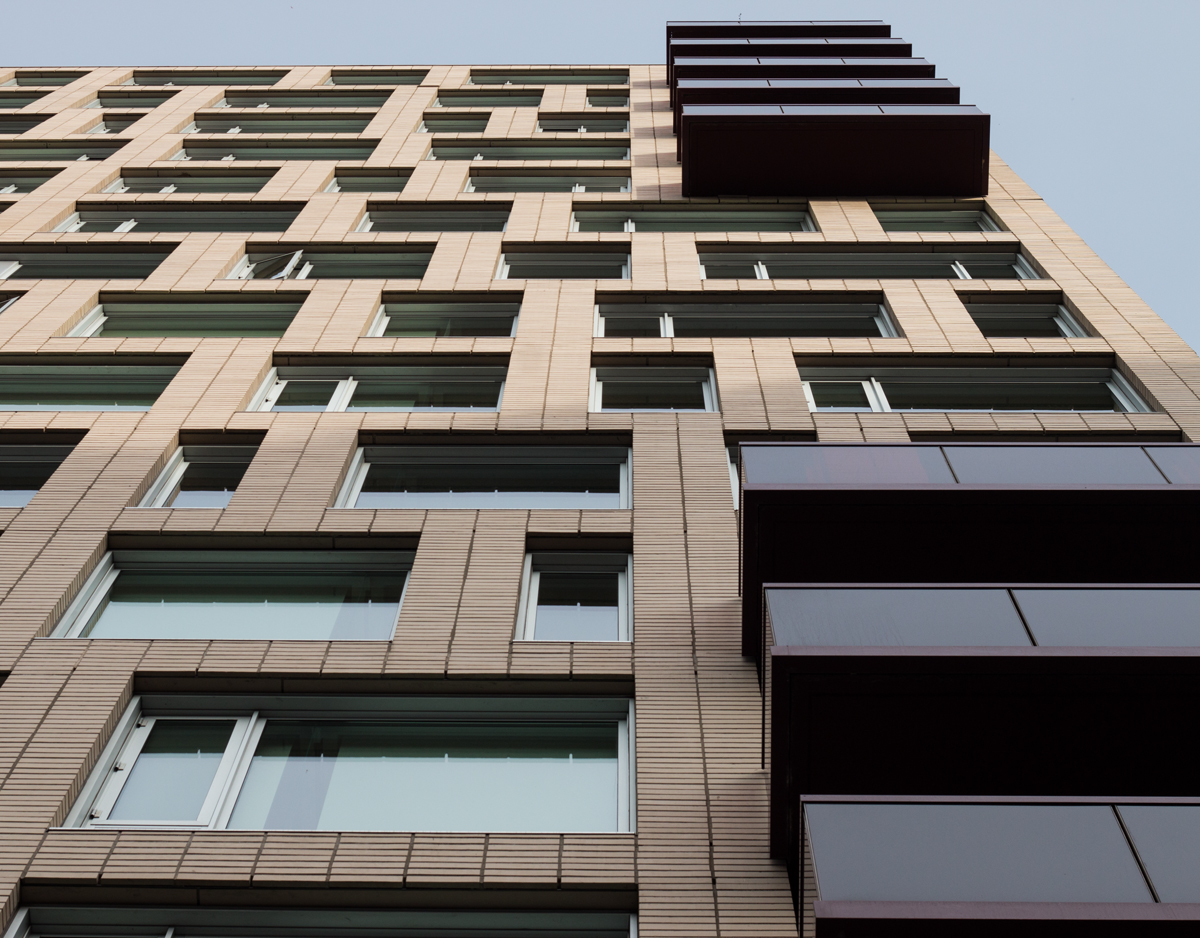
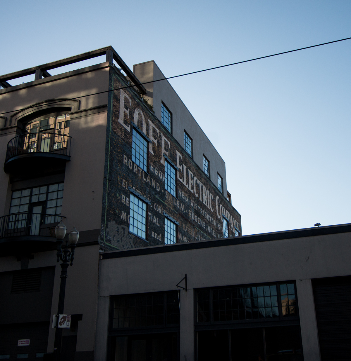
While we were in Portland, I read through a New York Times Sunday Magazine’s travel article by Karl Ove Knausgaard. While it’s a travel piece by a Norwegian in America, what really struck me were the photos. Doubly so once I realized the writer hadn’t taken them.
Often in travel writing, you’re trying to capture the charm or beauty of a place. You turn your head away from any ugliness, anything that shows where you are isn’t absolute perfection. You find the silver lining. You definitely don’t take a photo of the depressing view from your hotel room, of a back alley.
So, poor Portland, what bad timing.
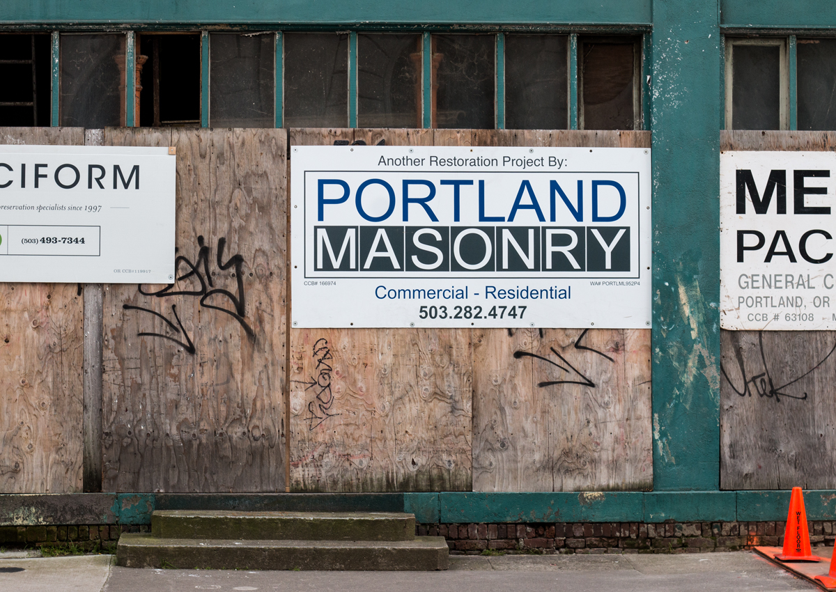
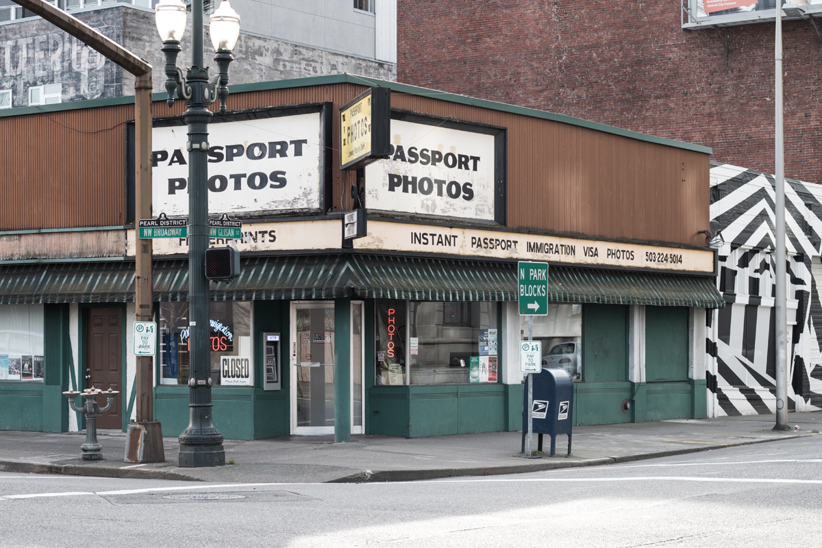
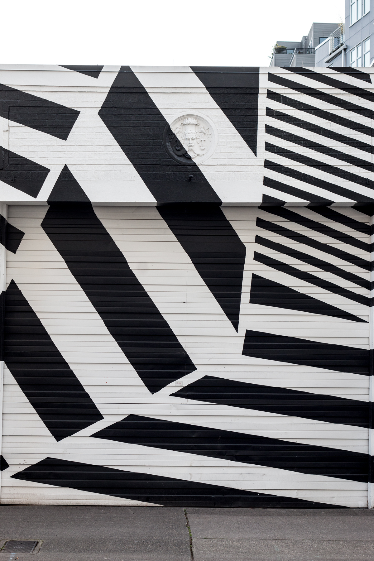
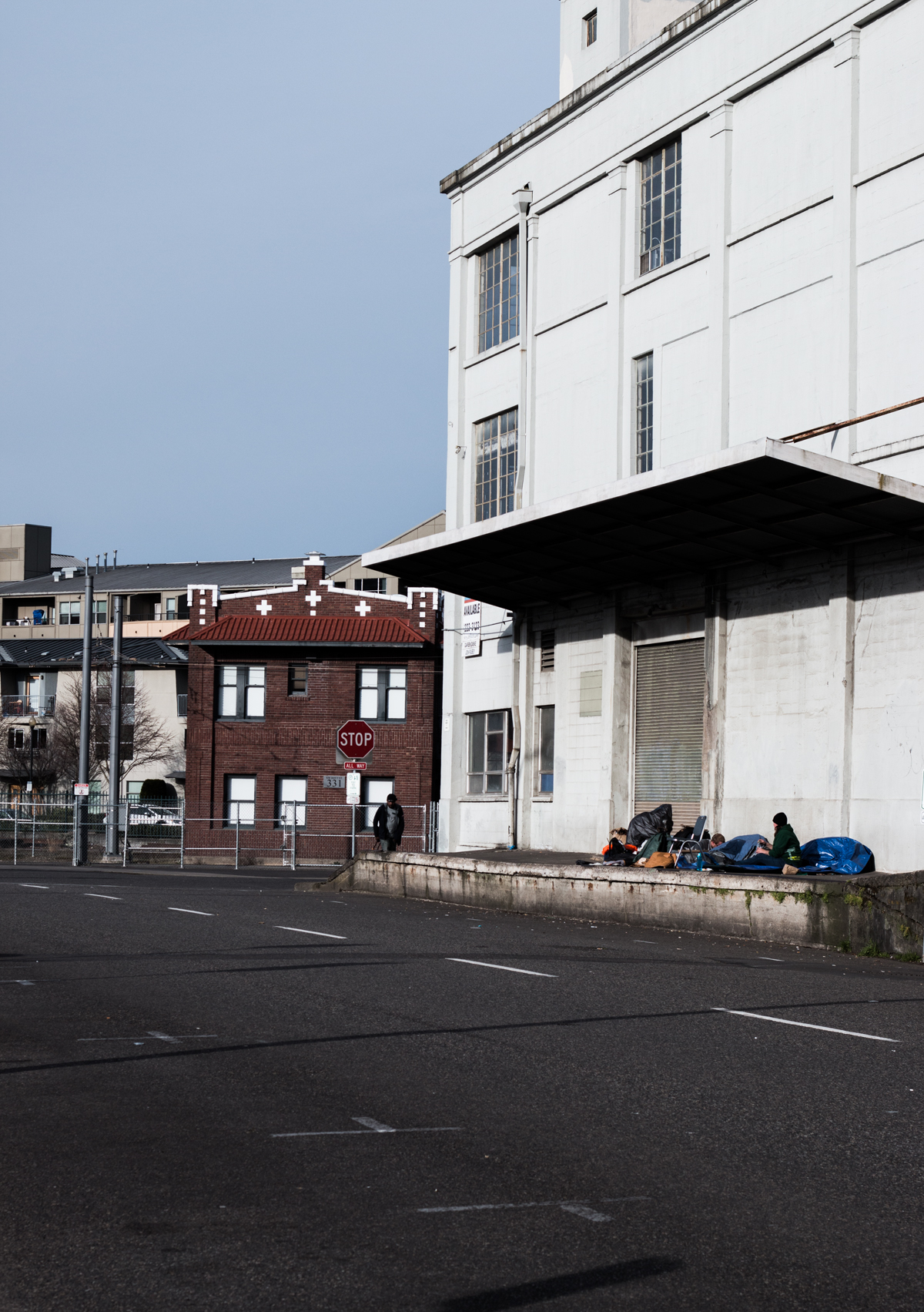
Dave and I always travel by transit when we’re away, and Portland being a darling of the alternative transportation world, we didn’t even think of renting a car. I could have taken photos of our final destinations, where the third wave coffee shops glistened and chocolate shops were outfitted like old-timey drug stores. But, I thought it’d be fun to do an experiment and take photos of what I actually saw — not only focus on the hipster cuteness, but what transit centers actually look like.
Here we go:


